
You're probably reading this article on mobile right now. So how does your website look on mobile? Broken? Slow? Then you have a serious problem.
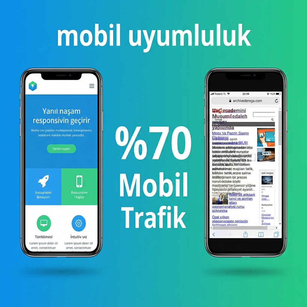
Critical Statistic: 70% of internet traffic comes from mobile devices. Mobile-unfriendly site = losing 70% of potential customers!
Mobile Reality in Numbers
Signs of a Mobile-Unfriendly Site
If your site has any of the following issues, it's not mobile-friendly:
Horizontal Scrolling
If the page scrolls left and right on mobile, the design isn't responsive. Visitors leave immediately.
Small Text
If you need to zoom to read text, user experience is zero.
Unclickable Buttons
If buttons are too small or too close together, wrong clicks and frustrating experience.
Extremely Slow
Loading over 3 seconds on mobile = 53% of visitors leave the site.
Broken Images
Images overflow, menus overlap, overall appearance is messy.
Menu Issues
Desktop menu doesn't work or is unusable on mobile.
Google Also Cares About Mobile
Important: Google has been using "Mobile-First Indexing" since 2021. This means it ranks based on your site's mobile version. If you're bad on mobile, you're bad on Google too!
| Criteria | Mobile-Unfriendly Site | Mobile-Friendly Site |
|---|---|---|
| Google Ranking | Low | High |
| Visitor Satisfaction | Low | High |
| Conversion Rate | Around 0.5% | 3%+ potential |
| Bounce Rate | 70%+ | 30-40% |
Frequently Asked Questions
You can use Google's free "Mobile-Friendly Test" tool. Also, you can test by opening your site on your phone. Contact us for a detailed analysis.
It depends on your site's infrastructure. Some sites can be updated to be responsive, others require redesign. We can show you the right path with a free analysis.
For most businesses, a mobile-friendly (responsive) website is sufficient. Apps make sense only for frequently used special services. First make a mobile-friendly site, app can be considered later.
Free Mobile Compatibility Test!
We test your site's mobile performance. We identify issues and provide solution recommendations.